Like snowboarding, art is nominally a subjective medium, but like slopestyle and the halfpipe that doesn't prevent people from trying to judge it. Today we've amassed the poster art from the history of the Winter Olympics so that we can all practice for the Olympics by having a good topical judge. See what you think...
The very first Winter Olympics, the first Winter Olympics poster and I suspect we've already found the winner.
Gigantic eagle attacks bobsledding fishermen
No helmets, not even a woolly hat - Men were men in the first Winter Olympics
1928 St. Moritz, Switzerland
1932 Lake Placid, United States
Lake Placid strangely didn't go for the giant man-eating crocodile motif, but instead went for a more low-key winter sports theme.
Other than being dull, this poster loses extra points for the sheer uselessness of the map
1932, the world's first half-pipe and the brave souls who tried to ride it in a sled.
1936 Garmisch-Partenkirchen, Germany
Great design, shame about all the awkward Nazi context.
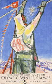
1948 St. Moritz, Switzerland
St. Moritz again, but this time they got a whole load more creative.
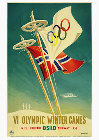
1952 Oslo, Norway
They just copied the 1928 St. Moritz poster and added an extra blue cross
1956 Cortina d'Ampezzo, Italy
1960 Squaw Valley, United States
The US guys sure love a flag and a pointless map on their Olympic posters. This one is more accurate, but it's hardy a useful navigational aid.
1968 Grenoble, France
1972 Sapporo, Japan
Considering the elements they had to work with here, this one is surprisingly crap. They just took them all and stacked them nonchalantly.
I've no idea what the massive sink-hole at the bottom signifies
1976 Innsbruck, Austria
Innsbruck again. They didn't try so hard the second time around.
1980 Lake Placid, United States
Lake Placid again, they just took the Innsbruck poster, reversed the colours and sharpened the corners.
1984 Sarajevo, Yugoslavia
They started off with the first good Winter Olympics logo.
Then they went to town with the arty. I really like these ones for the individual sports
The Phantom dominated the speed skating events in 1984
1988 Calgary, Canada
After the excitement of the Sarajevo, Winter Olympic poster creativity was brought back down to earth by the Canadians, who copied the logo idea a little too faithfully and then just threw it on a crappy background to produce this.
1992 Albertville, France
I like the ones they produced for the individual sports, nice and minimal.
1994 Lillehammer, Norway
Windows '94
1998 Nagano, Japan
The first Winter Olympics to include snowboarding and recreational drugs. I think the snowboarder was the little red fella,
or maybe the blue one? Who knows, I'm completely off my face.
Also this was the Olympics with the most perplexing addition to Winter Olympic posters, the peaceful image of a bird on a ski stick - what better way to represent a huge competitive sporting event.
The designer was probably on drugs
Back to the US, and back to the Olympic poster default option of the flag and a snowflake logo.
Although for the sake of all our sanity they have finally dropped the maps.
2006 Turin, Italy
I like this one, despite them not spelling Turin correctly.
And here's the first poster I can find of snowboarding as an individual event.
The designers for Vancouver produced an overall scheme that they then pulled through all their promotional materials, unfortunately the resulting poster from that process was a bit of a compromise.
The same idea was used to create posters for all three of the snowboarding events.
2014 Sochi, Russia
And finally we come to the newest poster, and the Sochi organisers have gone with this odd quilt looking thing. They didn't even bother to create a logo. If it wasn't for that crappy bird on a stick from Negano I would have put this down as the worst one of all time.

Hang on just one second, I've just found this beauty on their official merchandise site, featuring some classic stock photography of a woman who can't carry a snowboard.


