Signal's design a snowboard competition is on to the voting stage and there's just 5 days to get your votes in. As we've seen before the voting on these comps is completely nuts, so to save everyone a lot of time and effort here are the results...
The competition received a couple of hundred entries and they are mostly awful. To give you an idea of the level of quality, here is the board that we have scientifically identified as the exact average entry for the competition.
So now you have some sense of what we are dealing with let's get onto the awards
Top 3 Crappiest
3rd, for this crayoned snowboard sans Signal branding.
"Snow Board" by Grace Purti
2nd, for ignoring every rule of the competition
"sıgnal" By Osman Tiris
1st, for incredible feats of laziness
"kokakolya093@gmail.com" By Sergey "Yeah, that should do it. I should probably get on with planning what I'm going to spend the winnings on." Drykov
Top 3 Good ideas that almost made it
3rd - Good spot on the fish scales
"Fish and scale" By Anna Varakuta
"flying cardboard" By Fedor Porshnev
1st - Nice rocket Rodrigo, great work for the extra effort, it just needed a bit more variety between the two graphics.
"Guided to fly" By Rodrigo Colombo
Top 3 Most Every Third Thursdayish
3rd - A snowboard made from recycle motherboards
"Motherboard" By Ravichandra BG
2nd - Flowing liquid snowboard
"the centre of the snowboard is a box full of paintbrushes. as soon as the snowboard moves color flows out of the brushes into the board and into the Signal Logo. The effect is the same as with a Lava lamp. The whole board is see through and made out of plastic or glass. Both sides ( top and base) look the same as its see through."
"Artistic SnowB" By Irina Roknic
1st - The most dangerous snowboard ever conceived. Build it Signal!
"Baby on Snow // Bebe en la nieve" By Ksimiro Soto
Reminds me of the slightly more sedate baby stroller skateboard
To save you the trouble of nearly blinding yourself by looking through a couple of hundred entries here's our top ten including links for you to get your vote on. If the world makes any sort of sense the winner should come from this short-list.
(spoiler: it doesn't, it won't).
1.
I am a bit of a 'sea girl' so why not combine my love of the sea, fishing and snowboards into one design. I love the large, bright block color design to get you noticed in the pow!
2.
The graphics, created by three artists, wants to be a mirror in key cartoon and street art of emotions and situations in which you might encounter while you snowboard.
3.
4.
5.
6.
A Nahual is a mythical creature that has the supernatural ability to change into any form it wishes, such as Signal snowboards, who are always experimenting with new, creative and unexpected materials, turning their boards into what ever their imagination desires.
Where do the massive dumps of snow on powder days come from? From a goddess above, puking torrents of steaming cold, light and fluffy pow down onto the mountains. She is at once benevolent, mischievous, and uncaring as she sends her gifts through the clouds. And as the dawn creeps new we stand atop the mountains, calling forth our praises at the bounties she has bestowed!
8.
10.
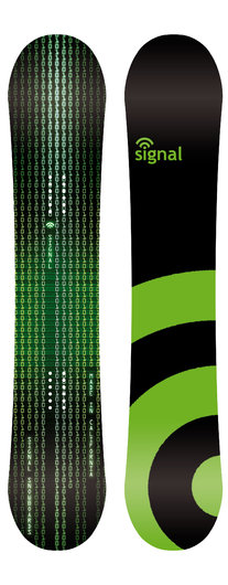
Even the most tired design in snowboard graphic competition history has 9 votes.
"SIGNAL MATRIX" By Ivan Schuler Pascasio
Get voting and have a good weekend everyone. Everyone that is except Ivan Schuler Pascasio who really needs to fuck off.
You Might Also Like...


